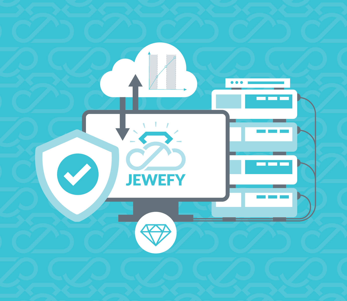
Welcome to JEWEFY,
The ultimate cloud platform designed specifically for jewelry shops. Our SaaS solution integrates seamless accounting, comprehensive bookkeeping, and precise inventory management with a powerful POS system. Enhance your business operations with ease and focus on what truly matters - your exquisite creations.

Streamline Inventory and POS for Your Jewelry Business
Integrate inventory management with a seamless POS system tailored for jewelry businesses. Track stock levels, process transactions, and monitor sales in real-time.
- Simplify operations with accurate reporting
- A user-friendly interface to enhance your business performance.
Optimize Jewelry Accounting with Seamless Precision.
Effortlessly manage your jewelry accounting processes with our advanced ERP module. Track purchases, sales, inventory, and profits in real-time, ensuring complete accuracy across all financial records. Visualize key metrics, streamline reporting, and maintain compliance—all tailored for the jewelry business.